Key Points
By design, the structure of traditional cap-weighted index causes a well-known tendency to buy high and sell low but also an underrecognized propensity for flip-flops.
Addition and deletion flip-flops add up to a shockingly costly drag on performance.
While the math behind cap weighting is sound, the costly flaws call for a smarter way to capture the market that avoids chasing exuberance and dumping despair.
The RACWI US Index is designed to address these deficiencies by changing how stocks get selected.
Rather than chasing price momentum or reacting to market noises, RACWI anchors index inclusion to a company’s real economic footprint.
RACWI US aims to retain the efficiency and transparency of indexing without the structural drawbacks of procyclical rebalancing, thereby adding meaningful value over time.
There has not been a fundamental innovation in broad-market cap-weighted indexing in decades. Until now. With the Research Affiliates Cap-Weighted Index (RACWI), we introduce a fresh approach designed to fix a costly but little-known “bug” in cap-weighted indexing.
For decades, cap-weighted indexing has been the gold standard of passive investing. Simple, scalable, inexpensive, and incredibly efficient—it’s no wonder trillions of dollars now track benchmarks such as the S&P 500, Russell 1000, and MSCI EAFE. But mainstream cap-weighted indexes aren’t entirely passive, and the active side of indexing is wild and costly. What if we told you that there’s a far better way to build a cap-weighted index?
Mainstream cap-weighted indexes aren’t entirely passive, and the active side of indexing is wild and costly. What if we told you that there’s a far better way to build a cap-weighted index?
RACWI preserves the familiar shape of cap weighting but adds a smarter filter on the front end—selecting stocks based on company fundamentals rather than market fads, bubbles, and crashes. The result? An index that aims to minimize buy-high and sell-low flip-flops—companies added during a frothy fad and dropped a few short years later—a brutally costly structural flaw of traditional cap-weighted benchmarks. Yet our new approach remains true to the low-cost, low-turnover DNA that passive investors love. Indeed, RACWI is arguably even more passive than the mainstream market leaders.
Who Needs a New Cap-Weighted Index and Why?
Cap-weighted indexes have long stood as the foundation of modern investing. They offer broad diversification, low costs, and full transparency. For investors seeking market exposure without active bets, they seem to deliver just that, tracking the ups and downs of the market with reliable consistency.
Cap-weighting may be simple in theory, but in practice, its structure can produce some unintended consequences. Because stocks are weighted by market value and market value is correlated with over- or undervaluation, these indexes naturally put most of our money in overpriced stocks, even though we cannot know which stocks these are. When a stock rises sharply in price—whether driven by fundamentals, hype, or speculation—it gains influence in the index. The opposite is true for falling stocks, which shrink in weight or disappear entirely when the stock is dropped from the index.
This creates a pattern that is easy to miss but hard to ignore: cap-weighted indexes tend to buy high and sell low—not by mistake but by design. Conventional cap-weighted indexing is famous for its very low turnover. If the turnover in a given year is 5%, then we might think of indexing as 95% passive (blissfully indifferent to the valuation multiples or price movements of the stocks in the portfolio) and 5% active.
That skinny active slice is wild, resembling the trading of an active emerging-growth manager on stimulants. Additions typically enter the index after long rallies, at huge premium multiples; deletions happen after prolonged slumps, at deep discounts. It’s a rules-based approach, but the timing of these changes is remarkably procyclical. On average, additions enter at more than 4× the valuation multiples of discretionary deletions. (Note that we are ignoring stocks that disappear because of corporate actions, such as mergers and acquisitions, as these must come out of the portfolio regardless). These mechanics create two key issues for cap-weighted indexes: (1) a well-known tendency to buy high and sell low and (2) an underrecognized propensity for flip-flops. These flip-flops are stocks that are added at frothy multiples, fail to deliver on their lofty expectations, and are dropped at far lower prices in relatively short order.
So who needs a new take on cap-weighting? Anyone who believes there’s a smarter way to capture the market, a way that avoids chasing exuberance and dumping despair. Cap-weighted indexes don’t chase trends on purpose—it just happens to be baked into their DNA. In that sense, we believe RACWI is a new and smarter species. The math behind cap weighting is sound, but there’s plenty of room to rethink how we decide what belongs in the portfolio to begin with.
Buy High, Sell Low—By Design
When a stock rallies relative to the market, its market cap grows and its weight in the index increases. If it is not already in the index and it crosses a threshold, it might get added, prompting all the index funds that track the index to buy. That’s when index funds step in to buy—often after much of the run-up has already played out. The same mechanism works in reverse: companies that fall in price shrink in market cap, drift down the ranks, and may eventually get dropped—after much of the damage is already done. The result? The index tends to buy mostly what’s newly hot and sell what’s newly fallen deeply out of favor. This trading is not a matter of poor judgment; it’s just how the math works.
Over time, this dynamic quietly drags on performance. Our research has shown that additions to the S&P 500 frequently beat the market ahead of their inclusion—only to lag behind in the year that follows. Deletions, by contrast, often rebound once they are dropped. These aren’t cherry-picked anecdotes; they’re structural features of how cap-weighted rebalancing operates.
This performance gap shows up in fundamentals too. Stocks added to the index aren’t just riding a wave of price momentum. By the time they get included, they’re usually much more expensive relative to their underlying fundamentals. In our 2023 Financial Analysts Journal study “Earning Alpha by Avoiding the Index Rebalancing Crowd,” we found that additions to the S&P 500 traded at an average valuation multiple 4.3 times that of the discretionary deletions they replaced. That’s not just a technical detail—it’s a signal that the index is buying stocks priced for perfection and offloading those priced for serious risk of oblivion.
Turnover Isn’t Always Productive—Especially Flip-Flops
Turnover is a necessary feature of index maintenance, not a flaw. Markets evolve, companies change, and benchmarks must adapt. Sometimes, however, the index seems to reverse course: a stock is removed not long after it was added, or a name previously dropped finds its way back in. When this reversal happens in less than a decade, we call these addition flip-flops (add, then drop) and deletion flip-flops (drop, then add).
These round-trip cases offer a compact illustration of how traditional cap-weighted indexes can struggle with timing. When a stock is added during peak optimism and later removed after that optimism has been dashed, it captures (within a single arc) the tendency to buy high and sell low. The reverse (deleting a stock during a slump only to re-add it after a rebound) reflects a different kind of miss: underestimating recovery potential. This kind of churn is costly. Each round trip means not one but two forced trades. These trades are initiated because of large price movements, so they rarely happen at favorable prices.
Our sample of component changes for S&P 500 and Russell 1000 starts from October 1989 and ends in May 2025. For the flip-flop analysis, we use flip-flops that started by May 2015 to allow a full 10-year-period for the flip-flop action to occur. From 1989 to 2015, shown in Table 1, across the S&P 500 and Russell 1000, there were more than 2000 discretionary additions and nearly 1000 discretionary deletions, amounting to over 3000 discretionary changes. For two indexes that together cover about 1,500 unique companies (with roughly 500 overlapping), these numbers speak to the dynamic nature of the U.S. economy. More than one-fourth of all stocks added to the S&P 500 or the Russell 1000 from 1989 through 2015 were dropped within ten years. Even more shocking, well over half of all discretionary deletions are flip-flops! These errors are expensive—and avoidable.
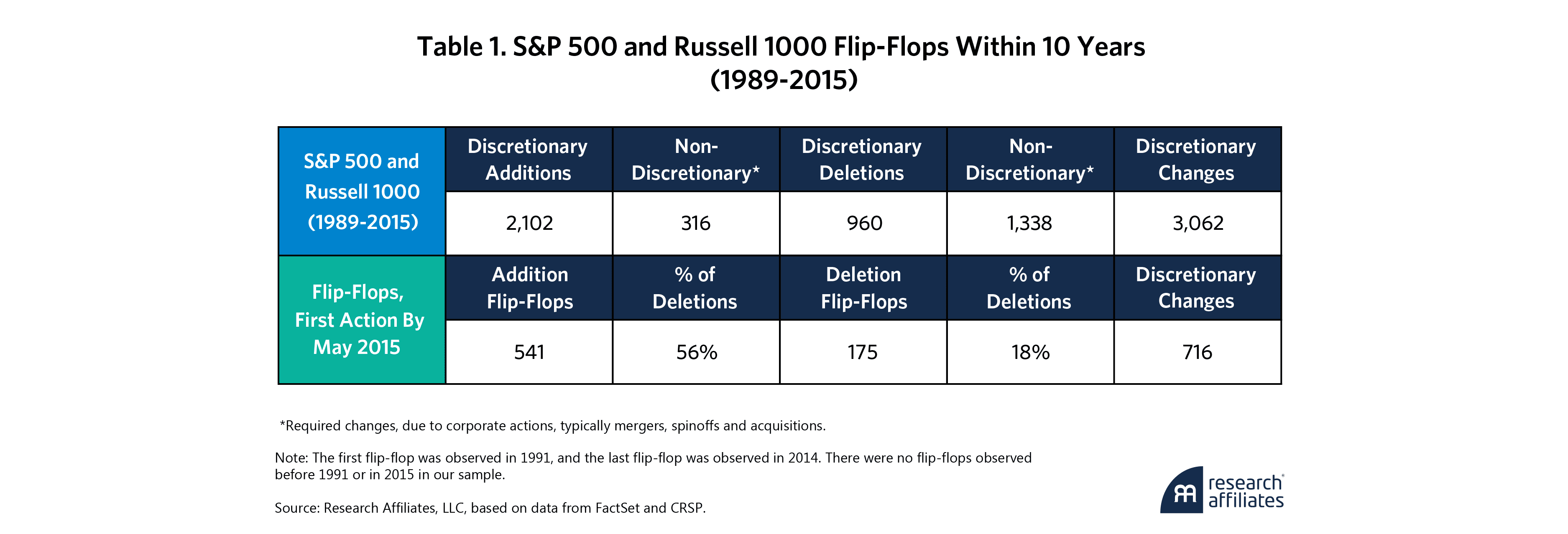
Exhibit 1 shows the average performance of these flip-flop stocks from both S&P 500 and Russell 1000 before, between, and after their two index events. Our analysis focuses on flip-flop stocks for which both the entry and exit (or exit and reentry) occurred within a 10-year window. Addition flip-flops (orange line) tended to surge before their initial inclusion and then fade after entering the index. Deletion flip-flops (blue line) dropped ahead of removal and then bounced back. But after the second index event—for both groups—returns were neutral on average. If the index was hoping to catch a breakout or a bounce, the data suggest the moment had already passed. The gains—or losses—were mostly behind them.
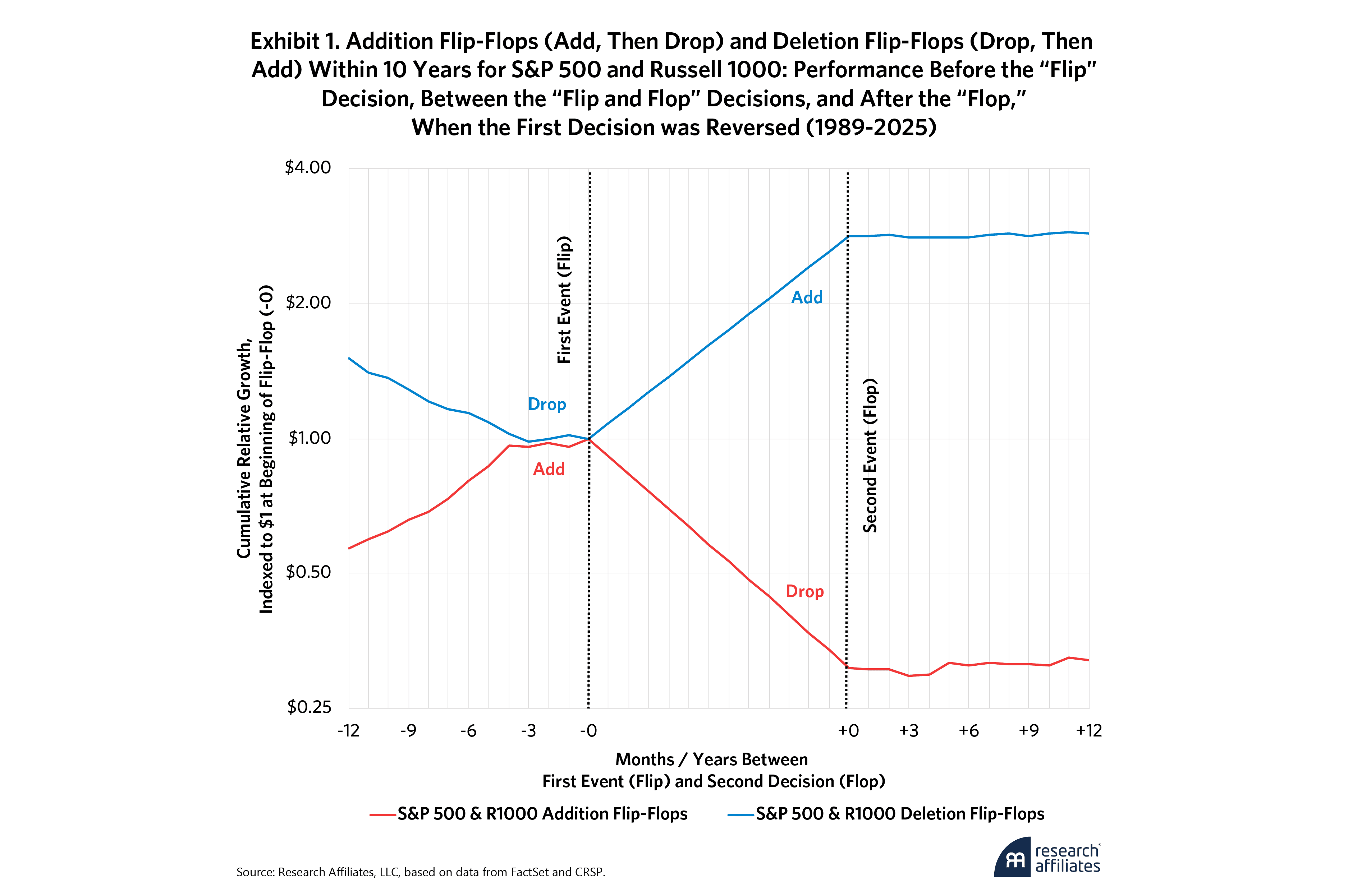
Table 2 puts hard numbers to the flip-flop story. Panel A shows that addition flip-flops are truly awful for index fund investors. First, they outperformed the market by a remarkable 75.6% in the year before their initial inclusion. Index funds missed out on this gain, and the gain played a starring role in the decision to add the stock to the index. Then they underperformed by 69.2% before they were kicked out. Indeed, that’s why they were deleted! Then, a year after being deleted, their average excess return was modestly positive, beating the market by an average of 3.7%, as we documented in our research on index deletions in (Arnott, Henslee, 2024).
In the most recent decade, the pattern was similar. The pre-addition surge was still very strong, though a bit more muted, at 48.3%. The post-addition slump was nearly identical at 71.8%, and the one-year rebound after deletion was slightly better at 5.4%. Of course, these data do not include stocks that have not yet been deleted but are destined to become flip-flops before the tenth anniversary of their accession into the index. Both the long and recent samples tell the same story: by the time these names enter the index, most of the upside has already happened.
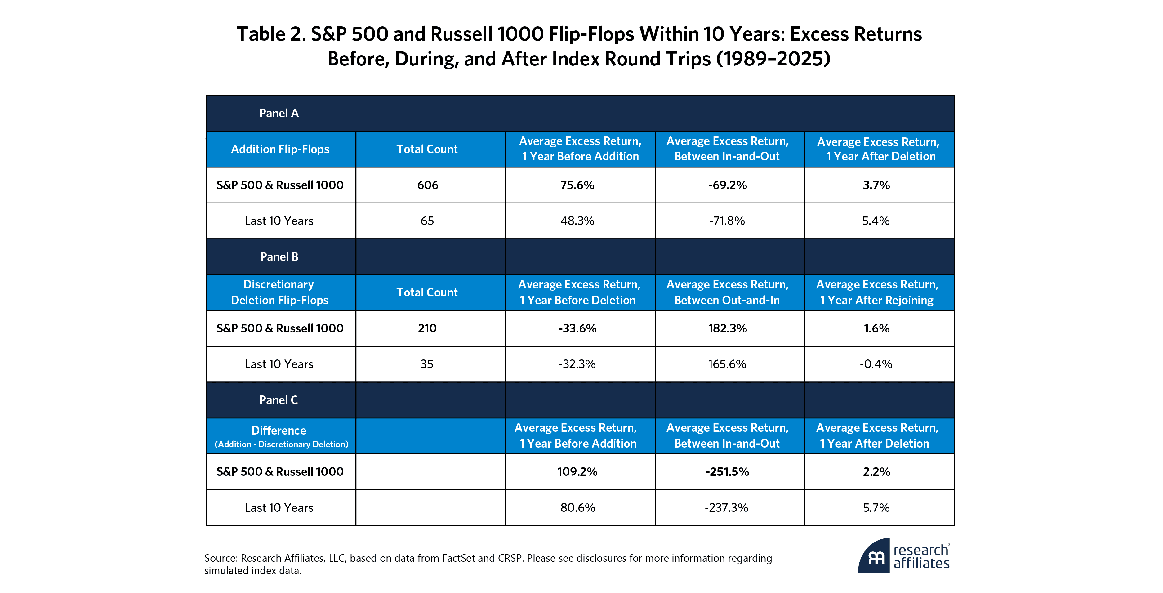
Panel B tracks the deletion flip-flops, and the pattern runs in reverse. These stocks lagged the market badly by 33.6% in the year before deletion and then enjoyed a stupendous rebound of 182.3% relative to the market while outside the index. A year after being re-added, their excess return averages an anemic 1.6%. The recent decade has shown much the same: lagging by 32.3% before deletion, winning by 165.6% while out, and remaining essentially flat (–0.4%) in the year after rejoining. Again, the key moves happened before and between the committee’s actions, not so much after.
Panel C highlights the asymmetry. While Panel A shows that the addition flip-flops swung from +75.6% to –69.2%, Panel B shows that deletion flip-flops did the opposite, going from –33.6% to +182.3%. Panel C highlights the gap in one-year pre-event returns, which was more than 100% in the full sample and a still-remarkable 80% in the most recent decade. Between addition and deletion, or between deletion and rejoining the index, the difference between addition flip-flops and deletion flip-flops is a humongous 250%. Yet once the second index action took place, performance flattened out. Just as Exhibit 1 illustrated graphically, the numbers in Table 2 confirm that index timing systematically lags the market cycle.
These asymmetries point to a deeper issue. Traditional cap-weighted indexes often respond to lagged price performance. Stocks are removed after prolonged underperformance and added after strong rallies. If those price moves are near-term peaks or troughs, the resulting turnover can lock in unfavorable timing—effectively buying near highs and selling at deep discounts. These buy-high/sell-low flip-flops are shockingly costly.
If those price moves are near-term peaks or troughs, the resulting turnover can lock in unfavorable timing—effectively buying near highs and selling at deep discounts. These buy-high/sell-low flip-flops are shockingly costly.
Suppose index additions require 5% turnover, and suppose that 30% of these are gone (as flip-flops) within 10 years. Further assume that these stocks underperform by two-thirds before they disappear. All three assumptions track with the empirical facts. For this scant 5% turnover, the cost to the index fund investor is 99 bps per year (5% turnover x 30% flip-flop share x 66% underperformance)! Why does this drag go unnoticed? Because indexes are their own benchmarks, so they cannot outperform or underperform!
It’s no surprise that deletion flip-flops behave in the opposite fashion. Flip-flops aren’t the norm, but they are too common to ignore, especially given their horrific costs. We already know from our research that deletions generally outperform for the five years after they are dropped from the index, as we explained in our article “Nixed: The Upside of Getting Dumped,” which inspired our launch of the Research Affiliates Deletions Index in 2024. Flip-flops hurt investors three times, with stocks added after they’ve already soared, dropped after they give it all back (and then some), and then modestly outperform after they are no longer in the index. The nearly 40% spread between the two types suggests that when the index turns over names quickly, it’s often catching names at their most extreme—chasing the hot new story or bailing at the bottom. Maybe it's reacting to hype or panic. Either way, the timing often seems to reflect where a stock has been, not where it is heading.
Valuation metrics underscore that point. When addition flip-flops get added the first time, they are already traded at lofty valuations, while deletion flip-flops (after suffering a long losing-streak, get dropped at deep discounts. At the time of their first index change, the valuation spread between addition flip-flops and deletion flip-flops was 4.7-fold, highlighting how quickly sentiment— and price—can swing between extremes.2
Putting everything together, these patterns raise important questions. Turnover isn’t inherently bad, but when it's driven by recent price trends rather than forward-looking fundamentals, it can lead to costly and poorly timed trades. Flip-flops make one thing clear: when index changes follow the rearview mirror, turnover can quietly become a drag instead of a tune-up.
So who needs a new take on cap weighting? Anyone who believes there’s a smarter way to capture the market—one that avoids chasing “irrational exuberance,” to borrow from Bob Shiller’s famous book title, and dumping despair. The challenge runs deeper than a few bad trades. Cap-weighted indexes (while elegant in construction) trade in this fashion as a feature, not an error, even though it may erode their performance and their customers’ wealth. The drag is measured in scores of basis points, which makes it far too easy to ignore, even though the drag is an order of magnitude larger than almost any index fund fees.
Easy to Fix: Just Change How We Choose Adds/Deletes
The problem is easy to fix because there’s plenty of room to rethink how we decide what belongs in the index to begin with. The RACWI US Index addresses this problem at the root by rethinking how stocks get selected in the first place. Rather than chasing price momentum or reacting to market noises, RACWI anchors index inclusion to a company’s real economic footprint.
Instead of picking stocks because they’re popular, RACWI focuses on companies that we believe matter in the macroeconomy—those with meaningful business footprints. The index identifies the largest U.S. businesses based on a blend of four long-term fundamental measures, each expressed as a percentage of all publicly traded U.S.-domicile companies:
book value (plus intangibles),
five-year average sales,
five-year average cash flow,
and five-year average dividends (plus buybacks).
We include the top 86% of the U.S. equity market by cumulative fundamental size, defined according to the four long-term measures above. As of June 30, 2025, 510 businesses comprise that top 86% of the publicly traded US economy; 410 of these stocks were also members of the S&P 500. Once selected, our 510 companies are cap weighted and float-adjusted.3 The simplicity of cap-weighting is preserved but with one important improvement: companies get in not because their price has soared but because their business is large enough to matter. In other words, we’re not cap-weighting a portfolio biased to favor the most expensive stocks; we’re cap-weighting the biggest businesses. Additions are companies that have grown their real economic footprint; deletions are firms that have shrunk in size, relevance, or financial strength. It’s a small change in selection, but one that makes several big differences: fewer flip-flops, lower turnover, additions far less extravagantly priced, and deletions priced at modest discounts.
It’s a small change in selection, but one that makes several big differences. . . . The result? A fundamentally grounded broad-market cap-weighted index with better macroeconomic representation and better performance.
Performance That Compounds
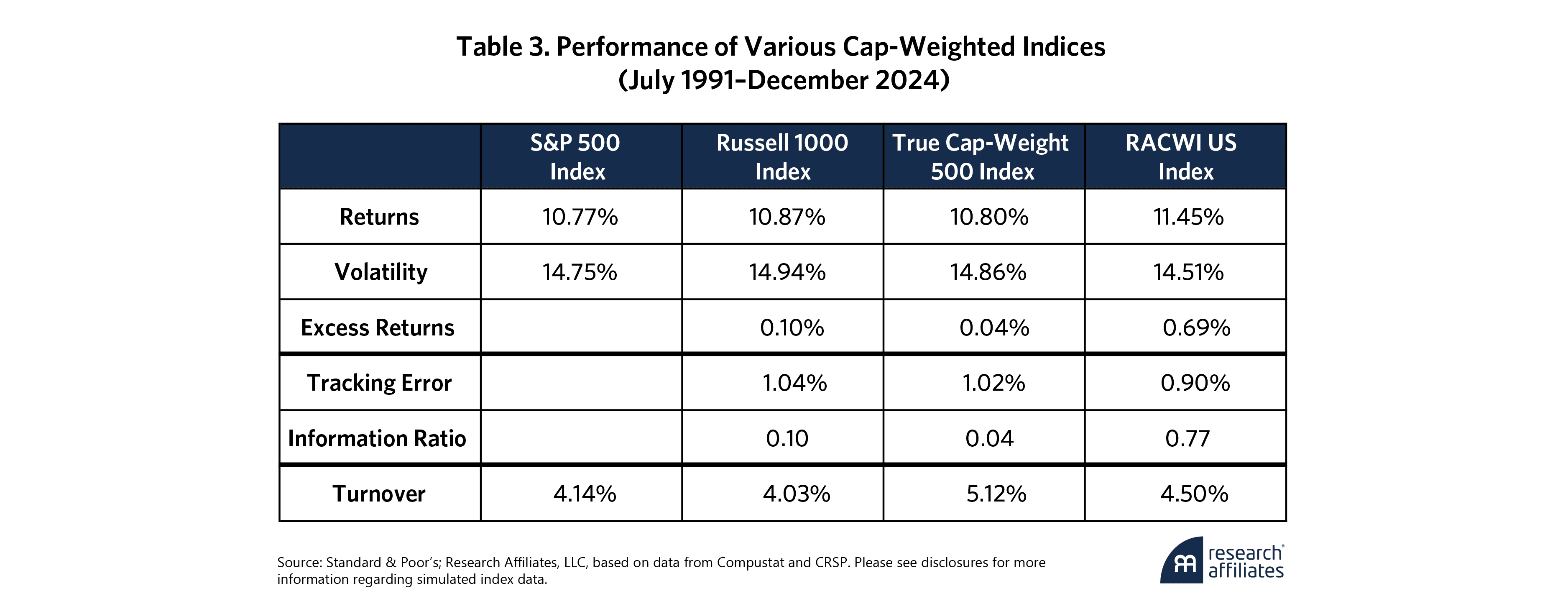
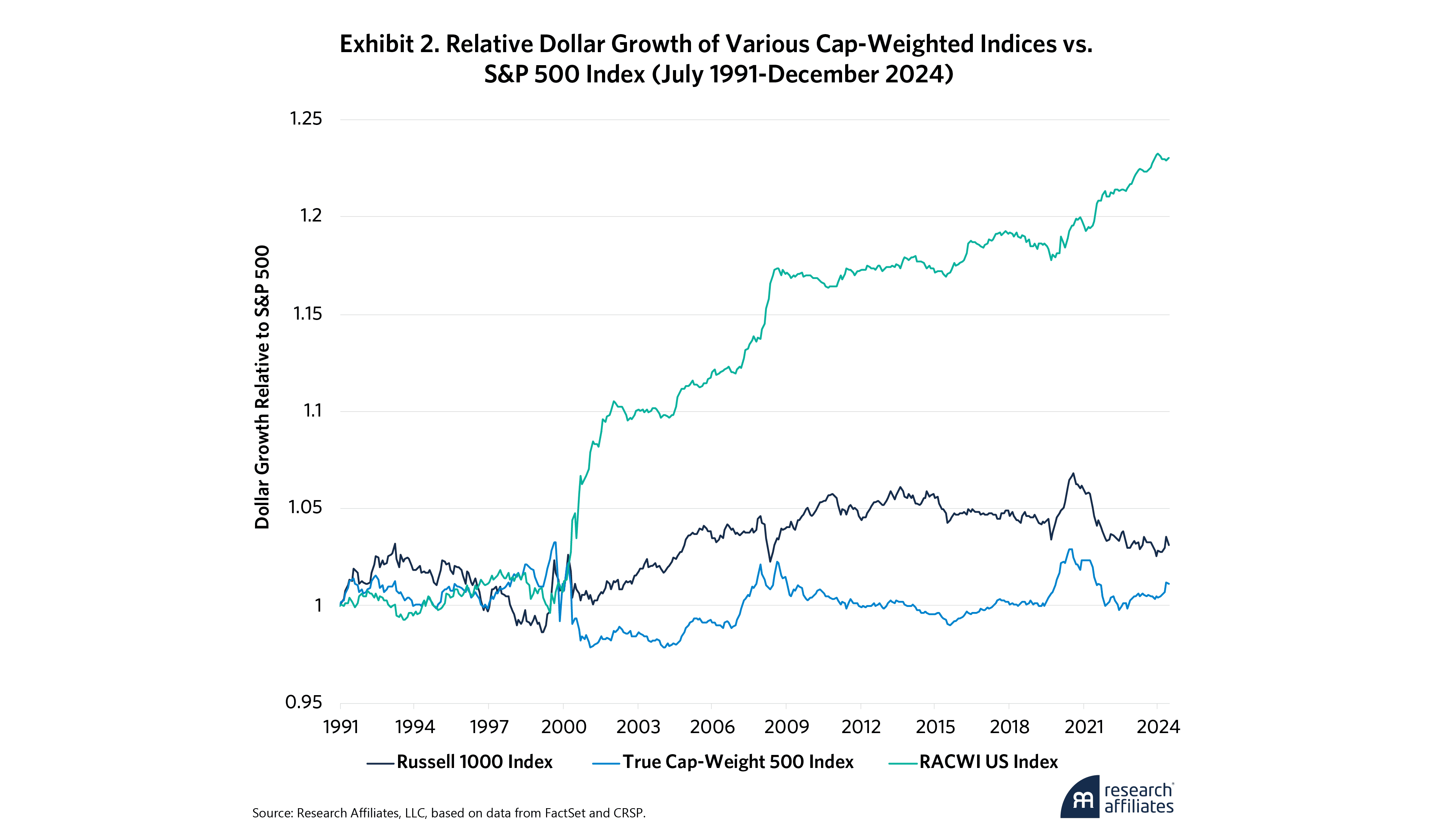
The result? A fundamentally grounded broad-market cap-weighted index with better macroeconomic representation and better performance. Table 3 compares the performance of RACWI US with the leading cap-weighted indexes, S&P 500, and Russell 1000. We also include a True Cap Weight 500 (“True CW 500”), which is constructed by identifying the 500 largest-market-cap stocks domiciled in the US in March of each year and holding that portfolio for the following year.4 From July 1991 to the end of 2024, RACWI US beat S&P 500 by 69 bps per annum, with tracking error of just 0.90% relative to the S&P 500. This tracking error is actually lower than that observed for the Russell 1000, relative to the S&P 500.
Though the headline difference in annual returns may seem modest, the compounding effect is powerful. In just over three decades, an investor in RACWI US would have accumulated approximately 23% more wealth than an investor in the S&P 500, as shown in Exhibit 2. With a turnover rate of just 4.5%, distinctly lower than the True CW 500 and only modestly higher than the S&P 500, RACWI achieves its long-term gains not by trading more often and not by active management but by smarter passive management.
Critics will say that this is an active strategy. It’s actually more passive than the S&P 500, which is chosen and managed by committee. It has lower turnover than a passive portfolio of the 500 largest market-cap stocks. The only thing that’s different is that we choose the largest businesses, not the largest market-cap stocks. If a stock has soared into the top 500 by market cap, we wait until the underlying business grows to justify that earlier price surge. We may be late to the party for the next Nvidia or Tesla (though RACWI added Tesla sooner than S&P did, in our research), but we won’t necessarily buy at a higher price than the early movers. And, we’ll also miss scores of companies that fail to deliver on lofty expectations and subsequently fall off the index in a painful buy-high, sell-low flip-flop.
It bears mention that the S&P 500, which many investors incorrectly assume holds the 500 largest-market-cap stocks, is managed by committee, not by formula. In that sense, it is an active strategy, not a passive index. That said, the committee does hold down turnover by not adding a stock just because its market cap has risen into the top 500. In fact, the purely formulaic True CW 500 has essentially the same return as the S&P 500, with 24% higher turnover and slightly higher risk.5 By contrast, RACWI has historically had essentially the same turnover as the S&P 500, with meaningfully higher returns and less risk.
Today, there are nearly 70 stocks in the S&P 500 that rank outside of the top 500 by market cap; indeed, there are two that don’t even make the top 1,000. This also means that there are nearly 70 stocks that are in the top 500 (including 10 that are in the top 200!) that the S&P Index Committee chooses to leave out of the index. In 2025, this list includes more than 20 tech/AI names that are large cap but have yet to turn a profit. Standard & Poor’s generally excludes stocks that have not yet produced a profit; this rule filters out some of the same companies that RACWI filters out.
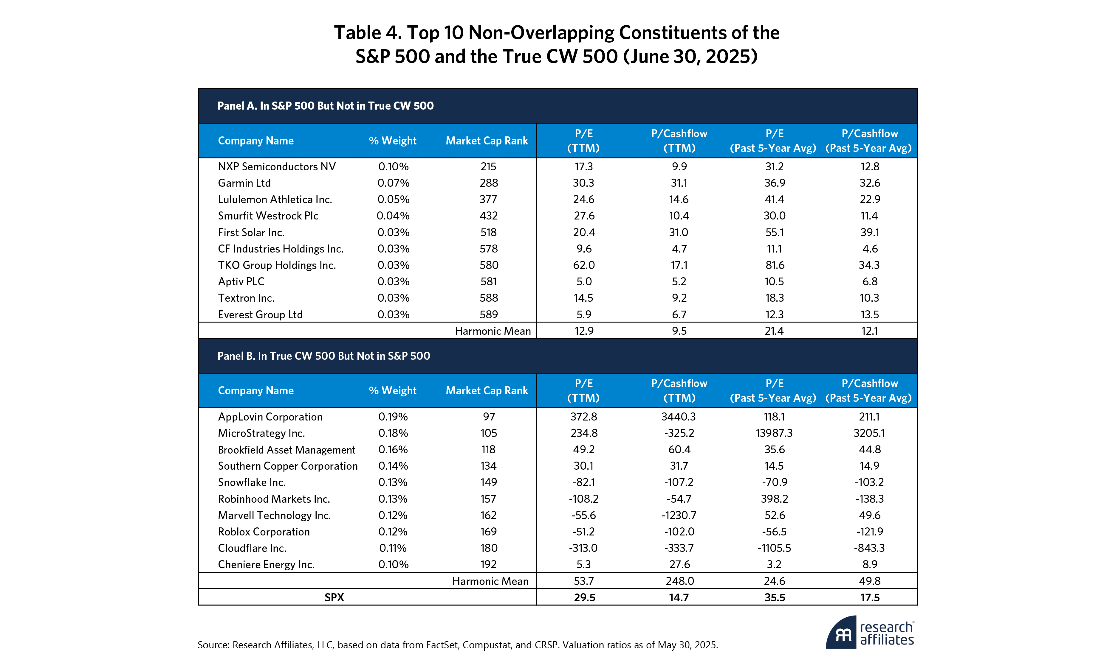
Table 4 shows the largest non-overlapping constituents of the S&P 500 and the True CW 500—the stocks that appear in one index but not in the other as of June 30, 2025. The contrast between these two groups is telling. The S&P Index Committee’s discretionary inclusions tend to be steady, cash-generative businesses that it favors, even when they fall well below the top 500 by market-cap. At the same time, it is worth noting that the S&P Index Committee appears to have made a conscious choice to leave out a number of large-cap names that have shown little aptitude for earning a profit, thereby sparing the index from speculative excess. The same holds true for RACWI, but with the added advantage of 69 bps higher historical annual returns.
The names in Panel A, the top ten members of the S&P that are below the top 500s by market cap— companies such as CF Industries, Aptiv, and Textron—are consistently profitable and trade at modest multiples, even though they are no longer part of the top 500 by market cap. This is a choice by the Index Committee that we applaud, even though it’s hardly passive. Across these top 10 names that the S&P Index Committee has permitted to remain in the index despite anemic market value is a very reasonable 12.9x earnings and 9.5x cashflow, while valuations based on five-year average fundamentals—which smooth through economic cycles—are also reasonable, at 21.4x and 12.1x respectively.
By contrast, Panel B lists the top ten stocks included in the True CW500 but excluded from the S&P 500. These tilt heavily toward speculative growth and aggressive valuations. Snowflake, Robinhood, Marvell Technology, Roblox, and Cloudflare are all large enough by market cap to qualify for the top 500 but show little consistent earnings power. Many report negative earnings or cashflow, which produces distorted multiples (even where earnings exist). The harmonic mean for this top 10 list comes to 53.7x earnings and 248.0x cashflow. Even when measured against five-year-average fundamentals, valuations remain stretched at 24.6x earnings and 49.8x cash flow.
The exclusions are not limited to loss-makers. A small set of comfortably profitable companies—Brookfield Asset Management, Southern Copper, and Cheniere Energy among them—are also absent, most likely due to sector representation preferences, liquidity considerations, or simple committee judgment. These choices make clear to us that the S&P 500 reflects not just market size but also the committee’s active hand in shaping the index.
The power of small differences
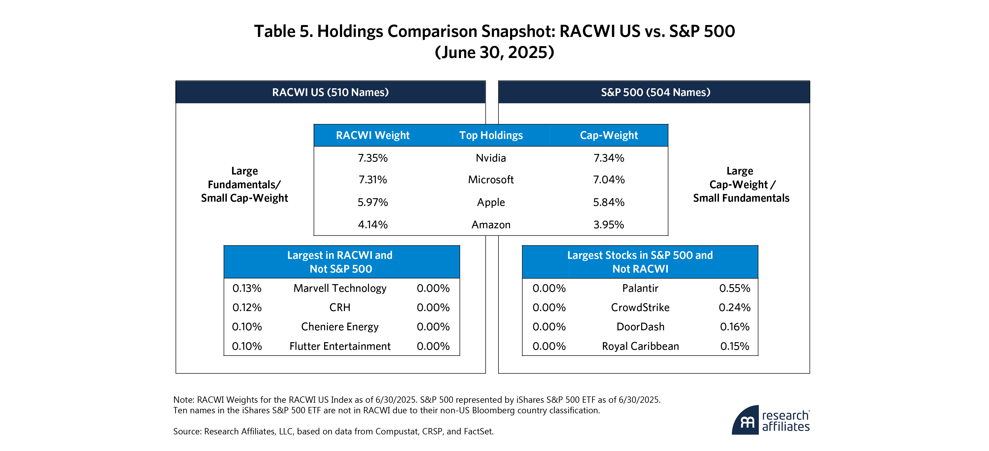
At first glance, RACWI and the S&P 500 look nearly identical: more than 95% of the value of the two portfolios overlaps, and those overlapping stocks are carried at essentially the same rank order and weights. The real differences lie only at the fringes, in two places: the handful of S&P names RACWI leaves out or the stocks S&P excludes but RACWI retains.
As Table 5 shows, the overlap is strikingly high—yet those small deviations are exactly where we believe the value is created. RACWI avoids rushing into speculative growth stories until their fundamentals warrant inclusion, and it holds on to substantial but out-of-favor companies until the business case for removal is clear. That extra degree of patience has been enough to add meaningful value, arguably leaving RACWI even closer to the spirit of passive indexing than are the conventional benchmarks that it seeks to improve upon.
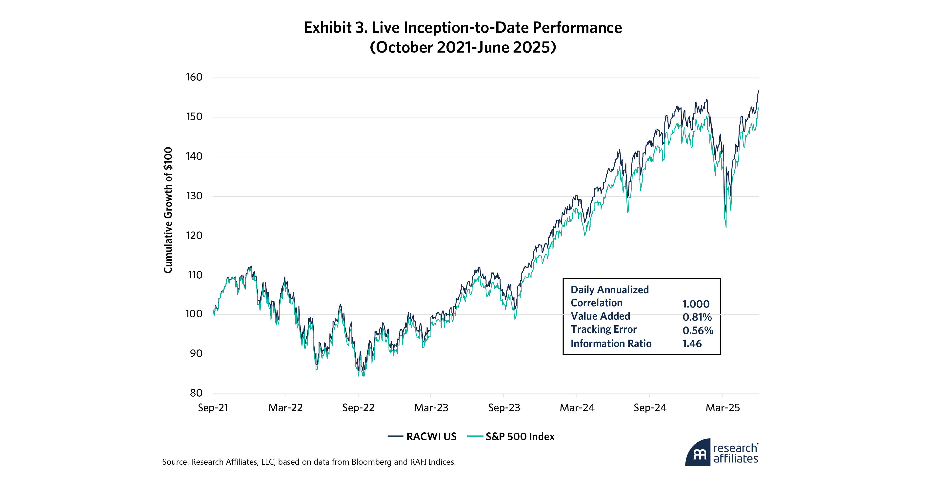
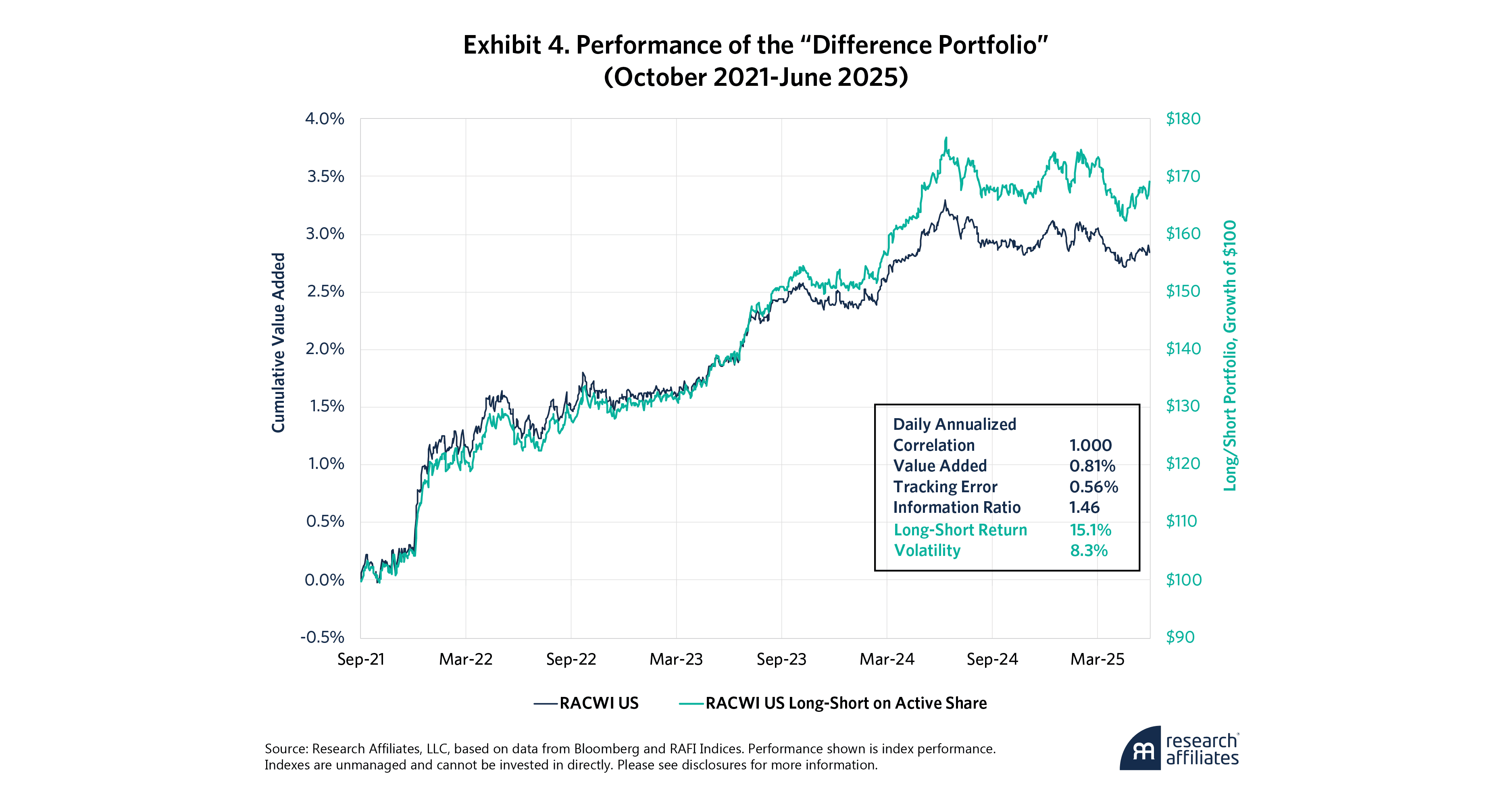
The historical results are continuing in live performance, as shown in Exhibit 3. Since its live launch on Bloomberg in September 2021, RACWI has outpaced the S&P 500 by 81 bps per year, with a tracking error of 0.56%. That’s a striking achievement for an index that overlaps with the S&P 500 in more than 95% of its holdings. If we are gaining 81 basis points as a result of less than 5% in holding differences, this means our 5% overweights must be beating the 5% excluded stocks by a mid-teens margin! Empirically, over this brief span, RACWI wins when value leads, wins when growth leads, and does so while maintaining extremely high correlation (99.95%) with the S&P 500.
To understand the effect of these marginal differences, we isolate the difference portfolio, which is long the RACWI overweights and inclusions (stocks in RACWI and not the S&P), and short the S&P’s corresponding overweights and inclusions. This slice represents less than 5% of total index weight, yet it is responsible for all of RACWI’s excess return.
Exhibit 4 illustrates this clearly. The blue line shows RACWI’s 2.9% cumulative value added relative to the S&P 500. In the world of index funds, this is a seriously large gap. The teal line tracks the 69% return of the long-short portfolio (based on the “active share” of RACWI relative to the S&P 500) for only 3¾ years. Here, we invest in the stocks that are a larger share of RACWI than in the S&P 500, including those that are in RACWI and avoided by the S&P 500. We are shorting the opposite: the S&P stocks that are excluded in RACWI. Since RACWI’s launch in September 2021, the difference portfolio has delivered over 14% total return, with a surprisingly modest volatility of about 8%. This return includes the yield on collateral (technically, the “short rebate”), which averaged about 3% over this span.
The lesson is striking: RACWI behaves almost identically to the S&P 500 in aggregate, but a handful of patient decisions at the margin—avoiding speculative growth stories until fundamentals validate investor enthusiasm, thereby avoiding frothy failures, and holding on to substantial businesses until fundamentals truly warrant their removal from the index—are what may transform those small differences into meaningful long-term value.
What drives the outperformance?
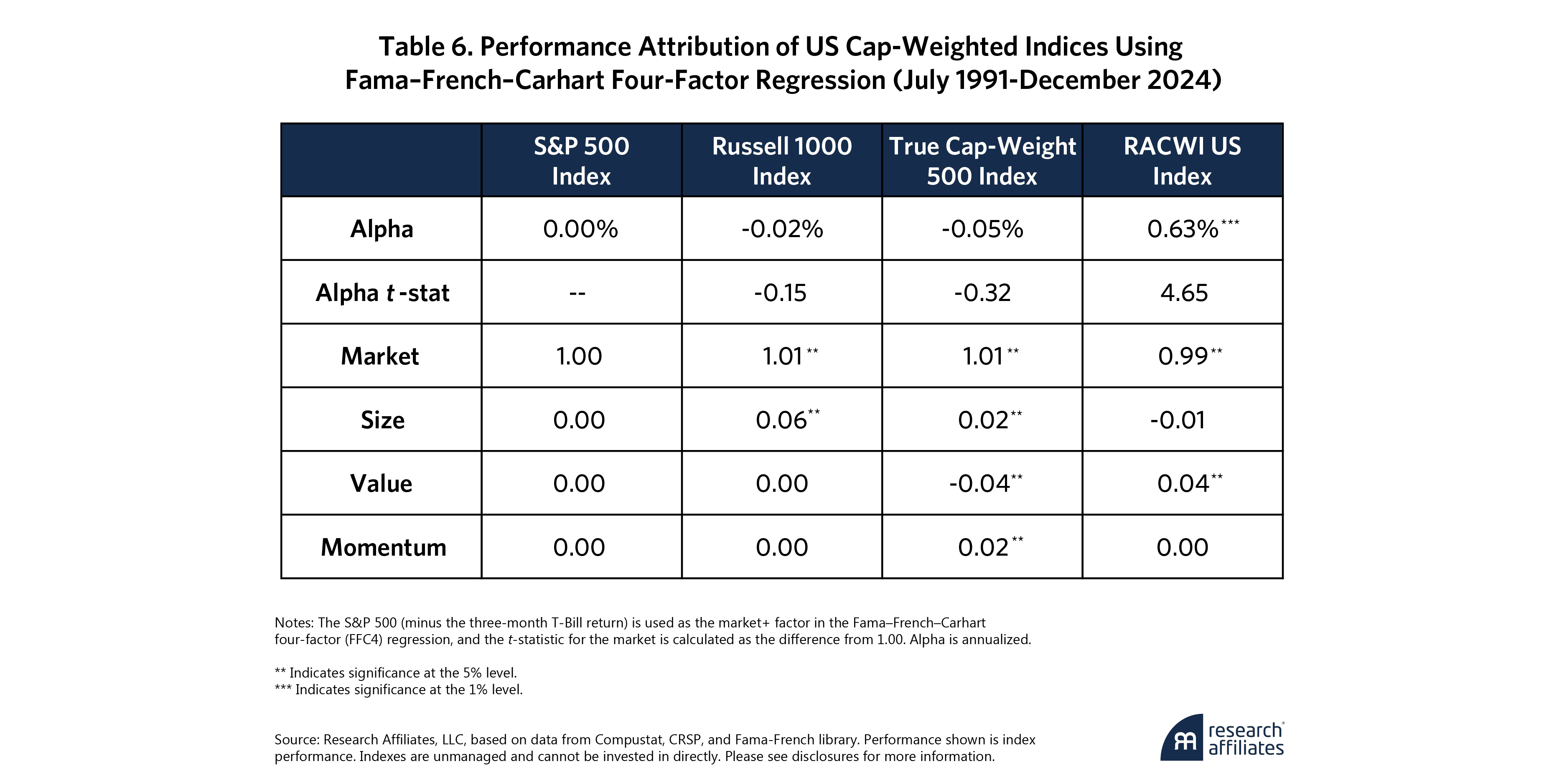
Some might wonder: Is RACWI’s outperformance just another value story in disguise, or is it merely a recent phenomenon that occurred during the odd “market cycle” of 2021–24? Fair questions, which we tested directly. To dig deeper, we ran RACWI and its peers through a Fama-French-Carhart four-factor model, each measured against the S&P 500, going back some 33½ years. This framework breaks down returns into four building blocks: overall market exposure, size (small vs. big), value (cheap vs. expensive), and momentum (recent winners vs. losers).
We found that all the indexes have market betas near 1.00, as one would expect, shown in Table 6. The Russell 1000 has a slight small-cap tilt thanks to its broader universe. True CW 500, built purely on market cap, has a noticeable lean towards growth and momentum when measured against the S&P 500. RACWI has a small, albeit significant, value tilt—no surprise, since it selects stocks based on fundamentals—and a perhaps-surprising large-cap tilt relative to the S&P 500 (then again, the S&P has almost 70 names that are not in the top 500 by market cap). But that’s not the whole story. Even after accounting for all style exposures, RACWI retains a risk-adjusted alpha of 63 bps per annum, with very powerful statistical significance.
What explains that risk-adjusted alpha?
One major contributor is RACWI’s ability to avoid common pitfalls baked into traditional indexing, notably fewer momentum-chasing flip-flops. Cap-weighted indexes often end up emphasizing stocks that are expensive and de-emphasizing those that are undervalued—because market prices drive both inclusion and weight. By contrast, RACWI sidesteps this dynamic. It excludes some S&P 500 companies that trade at lofty valuations but have relatively small business footprints. In their place, it holds companies with substantial fundamentals whose lower multiples would otherwise leave them outside traditional large-cap benchmarks.
If markets were perfectly efficient, those valuation gaps wouldn’t matter—future growth and risk would be fully priced in. But if markets aren’t always right, RACWI’s discipline in emphasizing real business size over hype will provide a clear advantage. That advantage shows up in two key ways: less exposure to often-overvalued highflyers and more exposure to undervalued workhorses. This is a second reason for RACWI’s historically higher return and lower risk. Stocks that are frothy (based on narratives about future growth that may or may not materialize) tend to be riskier.
This discipline matters most in cases where conventional indexes “round-trip” stocks in and out. Recall Exhibit 1, where we showed how S&P 500 and Russell 1000 flip-flops tend to buy high and sell low. Addition flip-flops surge before their inclusion only to fade afterward, while deletion flip-flops sink before removal then rebound after. In both cases, the index tends to lock in poor timing, with returns going flat after the second event.
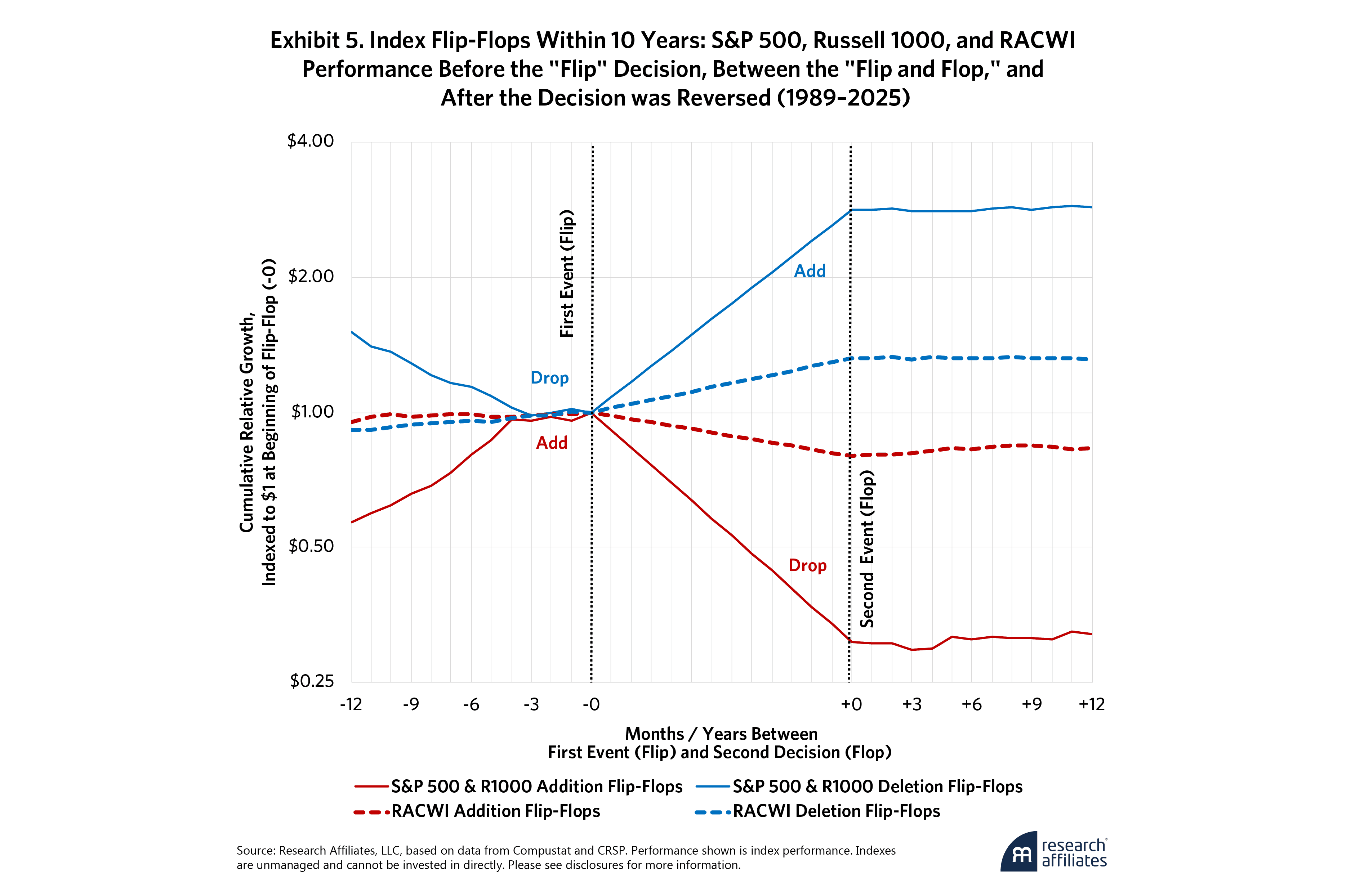
Of course, RACWI will also make mistakes, adding a stock that fails to deliver the goods or dropping a stock that regains its footing. Exhibit 5 extends that analysis by comparing performance of RACWI’s flip-flops, with those of the S&P 500 and Russell 1000 indexes. Since price performance plays no role in deciding which stocks to add or drop from RACWI, the flip-flop story looks different from what we saw in the S&P 500 and Russell 1000. The swings were far less dramatic. RACWI addition flip-flops produced only modest patterns—historically outperforming slightly before they enter the index, lagging by 20% before being removed, and then posting mild outperformance in the year after removal (yes, index removal is a positive sign even here!).
RACWI deletion flip-flops also behaved very differently from S&P and Russell deletion flip-flops. They tended to outperform ahead of removal, perhaps because investors had already marked down the shares long before the business contracted enough to trigger deletion. They then outperformed again before being re-added (but by 32% instead of the 182% outperformance logged by conventional CW index deletion flip-flops in their years in the out-of-index wilderness) and subsequently delivered neutral results (a 1% shortfall on average) in the year following re-entry.
Taken together, Exhibit 5 makes the contrast clear. RACWI avoids the costly procyclical timing we see in traditional cap-weighted indexes. Big price moves aren’t a major driver of decisions to add or drop a stock. RACWI doesn’t rush to buy simply because a stock has soared, and it doesn’t cut exposure just because a stock has collapsed.
By avoiding some of the buy-high/sell-low flip-flops, we benefit as valuation multiples mean-revert. This phenomenon, known as “migration,” was first explored by Fama and French in 2007. They found that value and small-cap strategies often outperform because of rebalancing into cheaper stocks and away from pricier ones. Chaves and Arnott quantified this effect as a substantial “rebalancing alpha” in 2012 (“Rebalancing and the Value Effect,” Journal of Portfolio Management). Cap-weighted indexes tend to do the opposite: rebalancing into recent winners and out of recent losers. RACWI flips this script. Its historical outperformance isn’t just a matter of style—it’s a structural advantage grounded in how stocks are chosen in the first place.
Proving Ground: RACWI in Turbulent Markets
In Arnott et al. (2023), we quantified just how much traditional cap-weighted rebalancing can cost investors. Over the previous 30 years, additions to the S&P 500 entered at a staggering 92% valuation premium relative to the market and 430% premium relative to discretionary deletions. With annual turnover near 4.4%, this pattern creates a structural tilt toward expensive stocks—effectively making the index pricier with each rebalance.
RACWI sidesteps this cycle. By selecting stocks based on business size rather than price action, it avoids chasing hype and maintains exposure to undervalued (yet healthy) firms with room to rebound. That discipline can pay off, especially when markets become tumultuous.
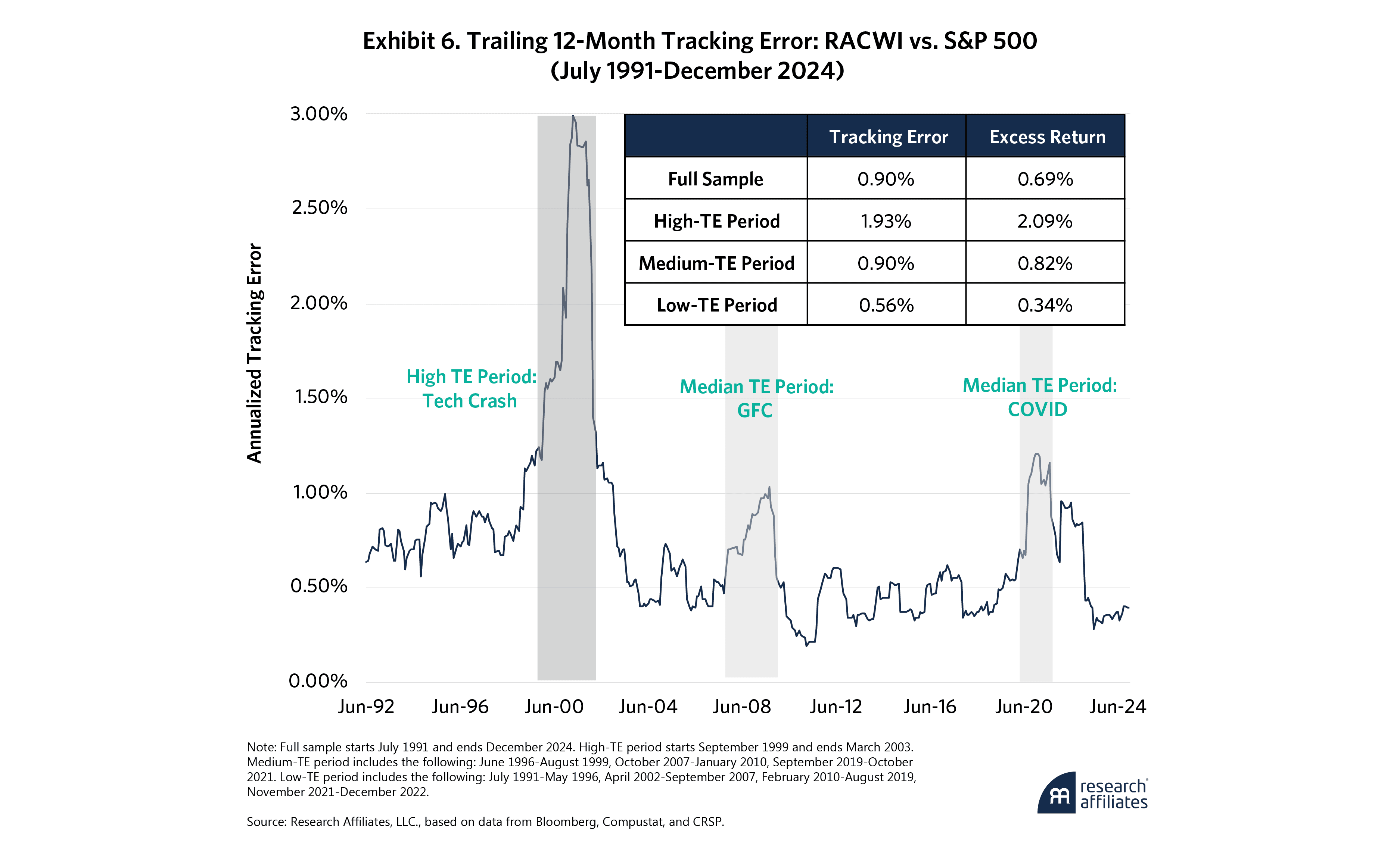
If RACWI’s edge truly comes from avoiding harmful, mean-reverting pricing errors, then its outperformance should be most pronounced when those errors are at their worst—when mispricings widen substantially and valuation dispersion spikes. And that’s exactly what we have observed. During periods of market turmoil—like the tech crash of 2000–2002, the Global Financial Crisis, and the COVID cycle—RACWI’s fundamentals-first approach delivered some of its strongest excess returns.
Exhibit 6 plots the trailing 12-month tracking error of RACWI US relative to the S&P 500 over more than three decades, along with a breakdown of RACWI’s excess return during different tracking-error regimes.
We divide the history into three periods:
High TE (tracking error ≥ 2%): periods of market dislocation, such as the tech crash of 2000–2002.
Medium TE (TE between 1% and 2%): spanning major disruptions like the Global Financial Crisis and COVID crash.
Low TE (TE < 1%): more stable bull markets with narrow performance dispersion.
Consistent with our thesis, RACWI’s outperformance is typically most pronounced when tracking error is highest. During the high-TE period, RACWI beat the S&P 500 by over 2% per annum. During medium-TE periods, the advantage shrank but remained meaningful at 71 bps per year, and in low-TE markets, performance differences narrowed to 24 bps per year—still positive but more modest.
This pattern isn’t coincidental. When price volatility and dispersion surge, so does the cost of chasing trends and overpaying for recent winners. RACWI’s methodology helps mitigate those risks—not by trying to time volatility but by simply staying grounded in business fundamentals. The result is a structural advantage that may shine most brightly at the peak of market chaos.
RACWI US: Cap-Weighting Reimagined
RACWI US offers investors a fundamentally grounded alternative to traditional cap-weighted strategies. For those who appreciate the efficiency and transparency of indexing but want to avoid the performance drag of procyclical rebalancing, RACWI provides a potentially powerful solution.
It seeks to preserves the core strengths of cap weighting—broad market exposure, scalability, and low turnover—while anchoring stock selection to economic fundamentals rather than recent price moves. That has historically meant fewer costly trades, better timing of inclusions and deletions, and more stable long-term performance.
The beauty of RACWI lies in its simplicity. Today, more than 95% of its holdings mirror the familiar benchmarks, but the small differences at the edges—patiently chosen and fundamentally justified—are what can add meaningful value over time. It’s indexing that looks and feels like the familiar market indices yet may quietly improve on them.
For long-term allocators, model portfolio builders, and anyone seeking smarter diversification, we believe RACWI US represents cap weighting refined for the real world, designed to endure, and to deliver.
End Notes
1. A special thanks is owed to Chris Brightman, Cam Harvey, Que Nguyen, Robert Barnard, Forrest Henslee and Gaurav Tamba for their insightful contributions to this research and to this paper.
2. Any valuation multiple will create a distorted picture. For example, price/earnings can make a cyclical stock seem attractive just as its earnings crest ahead of an economic downturn. Accordingly, whenever we don’t specify a particular ratio, we are using the average of five relative valuation measures—relative price/earnings, relative price/sales, relative price/cash flow, relative price/dividends and relative price/book value—so as not to anchor on a single metric.
3. We use Bloomberg’s definition of float, which differs slightly from S&P’s definition, leading to small differences in weight.
4. As a matter of respect for the intellectual property of Standard and Poor’s and of FTSE Russell, we use their indexes only for their returns, not their holdings or their characteristics. We construct our own True CW 500 and True CW 1000 indexes, for holdings and characteristics. When we need to look at holdings (for example, in considering how many stocks are in both the S&P 500 and RACWI US), we rely only on the holdings of the index tracker ETFs (e.g., SPY, VOO, or IWB).
5. While the CW 500 beats the S&P 500 by 3 bps per year, the S&P Index wins by 5 bps in risk-adjusted alpha (Fama-French-Carhart four-factor alpha, as shown later in Table 6).
References
Chaves, D., and R. Arnott. 2012. “Rebalancing and the Value Effect.” Journal of Portfolio Management 38(4): 59–74.
Arnott, R., C.J. Brightman, V. Kalesnik, and L. Wu. 2023. “Earning Alpha by Avoiding the Index Rebalancing Crowd.” Financial Analysts Journal 79(2): 115–131.
Arnott, R., and F. Henslee. 2024. “Nixed: The Upside of Getting Dumped.” Research Affiliates.
Shiller, R. J. 2000. “Irrational Exuberance.” Princeton University Press.


